Friday, October 31, 2008

Autumn in Las Vegas

Lots of things going on over here in my studio.

The backsplash project has been delayed a few days, while I juggle my schedule and wait for some materials. I used part of the time to go exterior door shopping with another client. I'll be installing his door next weekend, if all goes as planned. Going door shopping could send me on a huge rant about the employees at two local big box hardware stores. You know the ones, you have them in your town, too.

My two stores might have the LEAST helpful employees of all time. You know how you see badges on some employees, when they win some sort of award for attendence or whatever the hell they supposedly do? Well, the workers at our local stores should have to wear badges that say "I am from Planet Dork."

Hell, I'll make the badges for them.


And I have an upcoming post from a guest blogger who has been kind enough to allow me to write about his current project - building a set of Tage Frid's stools. I think Frid's stools are not only challenging, but force the maker to think outside the box.
He's sent some great pictures of his progress, and written about his process; it'll be an interesting post, so stay tuned.

Meanwhile, Autumn in Las Vegas is pure heaven. The summers can be brutal, but the weather we've been having lately is the reason we moved here. It's gorgeous and really makes me thankful that we took the plunge and moved across country. While my friends and family have been telling me about snow showers back east, I'm still gardening and wondering when I'll have to pull out some of the veggie plants.


The basil has gone to seed. Last year, I pulled all the leaves, washed and froze them in baggies for the winter. By the time Spring came around, I still had a few bags left, so I'll probably not put away so many this year.

The peppers continue to insanely grow, I have one plant that's so weighted down, it's growing like a vine on the gravel. The plant below is about 5' tall, it's reminds me of the Jack in the Beanstalk book.


Mums are always nice, these are just starting to open.


Did I mention the peppers?

I didn't even know this lemon was growing, until I started pruning the citrus trees.


And let's not ignore the mandarin oranges.


Stella couldn't figure out why I was crawling around the yard, and she tried to eat everything I was shooting. She's sort of our "special needs" child.


Oh, I forgot to mention - we're pregnant right now. Pretty soon, Stella will have a new sibling to play with (or pick on) depending on how well she adjusts to her new sister. One thing's for sure - a house full of schnauzers is never boring.

Sunday, October 26, 2008

Tile Backsplash - choosing a layout


It's easy to go insane when playing with tile positioning. Much of my Saturday afternoon was spend adjusting and rearranging the tile on the piece of cement board.

This is the layout I eventually chose, with an interlocking pattern. Because I made 75% of the short tile, and 25% of the taller pieces, I ran out toward the bottom. So the two bottom rows of tile don't have much interaction going on. I have a few more of the tall tile I set aside (the best ones) that I was hoping to keep for future projects. But I may end up adding them to this layout, just to keep things cohesive, whether they'll show or not. It would make me crazy to know that the bottom two rows don't match the rest, even though no one will ever see them.


If you doubleclick on any of these images, you'll get a close-up that will allow you to see some of the great coloring in these tiles.


Next step will be to mark these pieces so I can more or less reassemble everything on the wall.


Saturday, October 25, 2008

Love that Tivo

I'm still playing with tile (and shooting pictures) today, but I had to post this.

So last night, I was cooking dinner when the phone rang. I hit the "pause" button on my remote (love that Tivo!) and answered it.

What's the irony that when I went back to restart the TV, this was the exact screen that was showing?


I don't know about you, but this renews my faith that there actually is karma. Most of us will never get to actually experience it. But it's possible that this situation of spending $150,000 for clothes, along with everything else that she brings to the table, is blowing up in his face.

OK, I'm stepping off the soapbox and back into the studio....

Friday, October 24, 2008

Making a backsplash, part two

When I opened the kiln, this was my first glimpse of the tiles.


It's rather amazing that when those were loaded onto a shelf, they were nearly touching. The space around them came as they shrunk to their final size.

Since the wall where these tiles will be placed is heavily textured and painted, I decided to use a piece of cement board, or Hardiebacker board, to adhere to the wall, thus evening out the surface for installation.


And although the dudes at my local told me I could score the cement board with a utility knife and snap it, I know better. Accomplishing that is more difficult than it sounds, I've always gotten a jagged edge. So I switched blades in my tablesaw to an old one, one that I never use anymore, and prepared to cut the board by drawing out the profile needed.

Oh, I forgot to mention that I made a pattern first out of paper. So I simply traced the paper onto the cement board, and then started cutting.

This makes a god-awful amount of dust. In fact, there are warning labels on the board, letting you know how bad this dust (silica) is for you. So I took a few precautions:
slapped on my respirator, aimed my biggest fan so that it would blow the dust outside, turned on my air cleaner, and hooked a vacuum up to my tablesaw dust port.


Can't be too careful!


And after much coaxing and complaining (from my sawblade), here's the piece of cement board cut to size.


Next step - playing with the tile to decide it's proper layout. Since I'm a bit of a klutz, I started by placing the board on one of my shop carts.


I'm a huge fan of carts in my studio, they take a load off of my back, and allow me to move things easily around the room. This is my largest cart, perfect for holding this board as I play with the design.

I started by laying out a few tiles into rows; This was my original design.


After I finished, I rolled the cart outside to get a better view of these tiles in the sunshine.


My friend Adrienne, stopped by to see the tiles, so we ended up drinking a beer and figuring out solutions to the world's problems. We always have deep conversations when she stops by! So by the time she left, I couldn't decide which layout I wanted to use - the brick layout above, or a modular layout. I decided to sleep on it, and play with it in the morning.


Thursday, October 23, 2008

James Krenov video

Read this three times: my work was never the same after I read James Krenov's book - The Fine Art of Cabinetmaking.

Sometimes you read something that makes lights go off in your head. Or your jaw drop open. His book did both to me, at a time when I'd just gotten my degree in Furniture Design, and thought I had a solid grasp of design principles. Ha!

The San Francisco Chronicle has an article about JK, as he's known to his students.

Tuesday, October 21, 2008

Custom Tiled Backsplash

So I'm working on a small tile project, and I thought I'd take a few pictures and talk about it as I progress. It's a custom backsplash for a kitchen, specifically the area right behind a stove. That's usually the area that can get a lot of splashing and splatters, and if you're a messy cook, that area will look like ass the next time you make spaghetti sauce or fry some peppers.


Stove openings are generally 30" wide, and the area that I want to tile is roughly 20" tall . I plan on taking the tile lower than the counter height, for a little more protection to the wall.

So the first step (at least the way I do things!) is to decide which glaze to use. Here's a sample of the plastic laminate used on the countertop, it's mostly browns/beige with some very pale blue highlights.


I'm a big fan of modular tiles, where they all fit together and I have a little bit of leeway about the layout. Here's a sample of a wall piece, notice the four panels it it.


Each panel measures roughtly 9" x 10". Maybe it's boring, but I never get tired of using tiles that are 1,2,3,4, and 5 inches square. After the tiles are glazed and fired, I can lay them out in whatever pattern I choose. Here are a few examples.


After taking some dimensions, I decide that instead of using a modular system based on squares, I'm going to utilize a combination of a brick layout. I played around with the dimensions and decided to use two different sized tiles, that would allow me to add that variation into the design scheme. Since I was firing the kiln, added in some test tiles, to try and decide which glaze to use.

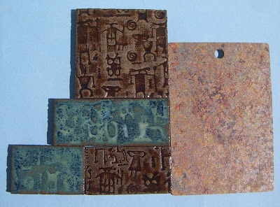
I felt like the countertop was crying out for a dark brown glaze, so here were my first sample pieces.


But I didn't love the way the colors looked with each other. While I was trying to decide what to do, I rolled out the slabs, added some texture, and bisque fired them.

Something I learned about making backsplashes - a while ago, I made about 5' of backsplash tile for a bathroom sink. Because I didn't want to have to fight the shrinkage of the clay, I made a variety of widths of these tiles, and then, after they were fired, picked out the ones that best fit the space I was tiling. I usually make way more than I need anyway.

So I decided to use that same method with this backsplash. The only thing I was concerned about was the height of the tiles, and I decided to make the height in two sizes, so that I could modularly fit the tiles all together. I'm so anal.

Back to choosing the glaze... I have maybe 25 or 30 different colors in my glaze pallette, some of which fire effortlessly, and others which give me nightmares. The ones that really seem to give me headaches are glazes with cobalt in them. They tend to blister, and can ruin perfectly wonderful pieces.

But - remember that the plastic laminate has some blue in it, so using a blue glaze might be perfect. For the non potters - cobalt in a glaze will give you the blue color. Only I was worried that I might have some blistering.

I belong to an online ceramic community, and there was a recent discussion about a glaze I'd never used, called Floating Blue. One potter said it was his favorite because it was so stable and dependable. Then, Ron Roy, one of the authors of Mastering Cone 6 Glazes, wrote into the ceramic board, saying that he'd reformulated the recipe for Floating Blue, to make it even MORE stable. Sweet. I trust any recipe that Ron shares, he's a glaze genius.

After mixing up a 100 gram batch of it, I painted a few tiles and stuck them into my next kiln load. Yow-zah! I think I'm in love. And despite the cobalt in the glaze, I didn't have any blistering at all.

See what I mean about the two different heights for the tiles?


I tested the glaze in several different thicknesses, and actually liked it a little thicker than normal, so that the texture on the tile was obscured. That meant three coats.


If you double click on the picture above, you'll see what I mean.


So all of my design problems had finally been solved - glaze choice, tile size, and layout. Time to start glazing.


The BM means Black Mountain clay. I use two different clay bodies, and they look quite similar when they're in this bisqued state. So I've learned to label them.


There were a total of 170 tiles. That means 510 coats to apply.


As I type this, the kiln is cooling. I'll be able to open it tomorrow, and you know what we potters say.... opening a kiln is like Christmas morning.

Sunday, October 19, 2008

Some of my favorite woodworkers

One of my favorite cities in the US is Philadelphia, mostly because it is home to the Philadelphia Furniture and Furnishings Show every spring.

Though the venue has changed, and the list of exhibitors is never the same, the show offers a consistently amazing array of woodworkers. I'm not 100% sure about this, but I think the show has also morphed into primarily a furniture show, rather than including things like lighting, fabrics (rugs, pillows and quilts), metal smiths, home accessories and more.

If that's true, it's a shame.

When I started attending the show around the mid-90's, it was held at the convention center, just a short walk from the Liberty Bell
and across the street from the Reading Terminal Market. Honestly, I'd visit Philadelphia just to go to this market, it's incredible.


Did you know the Liberty Bell cracked the very first time it was rung? If you're a geek like me, check out that link and read some more trivia about the bell. Think of all the bar bets you'll be able to win.

To round out my time in Philly and turn it into a truly decadent weekend, I'd stay at the Marriott there by the market, so that renting a car wasn't necessary. I don't have a lot to compare it to, but the public transportation in Philadelphia was so user friendly, I could land at the airport, walk to a train station, and take a short train ride to the convention center. My hotel was right there, so it was about as convenient as could be. Sweet. Since the venue has changed, I'm not sure about the accessibility to the new location. Regardless, it's an easy city to navigate, and full of artists.

Whenever I'd return home, I'd have a huge stack of brochures and color postcards from all the artists I'd met. Multiply that by the six or eight or ten years I attended the show - that's a buttload of information!

So I thought I'd share a few of my favorite artists that I'd met through the years. Artists are a funny bunch - some were friendly and open to discussing not only their work, but their "story" too - how they came to be a woodworker, or what their philosophy of woodworking was about. Others were more private, almost paranoid, as if sharing their thoughts would somehow allow someone to "steal" their designs. I've never understood that.


Anyway, here are a few of my favorite woodworkers. Enjoy.


John Reed Fox


John's work remains one of my favorite memories of the PFFS. His pieces look quite simple, but they're incredibly dignified and refined, with solid design and workmanship.


Years ago, I made a small wall cabinet that had sides with sculpted curves, much like the curves that John uses in the tops of his pieces. Those curves are much more difficult to make than they look. MUCH more.


Machining those curves once was enough for me. Combine that with his choice of woods, and his Asian influence, and... well, I'd welcome one of his pieces in my home any day.


Rachel's work has also been a favorite of mine for years. In fact, above my desk, I have a bulletin board with a few color postcards pinned to it, and one of Rachel's postcards is hanging here. The card is eight years old, which shows you how much I love the piece that's on it.

Here it is, postmark and all...


There's a simplicity and refinement to her work that I just love, not to mention that graphic nature of her designs.
And her use of milk paint is extraordinary. Rachel is currently president of the board of trustees of The Furniture Society.

After I requested permission to use these images, Rachel wrote to say that between her duties with the Furniture Society and her two small children, she's not building much furniture these days. I don't know about you, but I look forward to the day when she returns to it.


David Laro


There is a playfulness in David's work that I admire. He takes everyday objects, like a pair of scissors, a can of sardines, a wrench, or spaghetti twirled around a fork, and turns them into pieces of furniture.


His pieces are very well made, and any piece would be great accent in a home.
I love his sense of whimsy.


Del Guidice, Mark

Mark's work combines everything I love in a piece of furniture - great use of color and imagery, excellent craftsmanship, and a whimsical nature that belies the materials used. His work is so visually captivating that when I used to visit his booth, I would stay for hours, looking at every single carving. He probably thought I was a stalker.

By carving onto his pieces using a variety of symbols (including Morse code, heiroglyphics, and more), Mark tells us stories within each piece. His work represents the perfect justification for buying a custom built piece of furniture - his pieces are truly one of a kind.

Mark's website wouldn't allow me to send him an e-mail, so that I could get permission to put a few of his pieces here. But I highly suggest you check it out. When I win the lottery someday, I will commission a headboard like the one on his home page.

In a word - GORGEOUS.

Also, check out this video on Mark's work.


And finally...Phil was the only person who didn't answer my request to post some of his images here. But if I left him off this list, I'd be omitting one of the work of one of the most incredible woodworkers I've ever seen. Make sure you click on his name and check out his site.


Imagine a box, small enough to hold in your hand, but as precious as a piece of jewelry. Phil's boxes are light-years ahead of any boxes you will ever see.

(Read that sentence three time.)

His craftsmanship is incredible, with intricate detail and intelligent use of materials. Even the pictures on his website don't do them justice, they're best seen in a setting where you can see one after the other after the other. His boxes make most box-makers look like regular hobbyists - and that's not a slight on the rest of us woodworkers, it's a tribute to the work he produces.

Hope you've enjoyed my list.