Reading Craig's book is like taking a visit to his studio while he's building a table. The photographs allow you to follow along, step by step. In the book, he branches off into some interesting information, like giving you a tour of his workspace, showing his collection of planes and other tools, and even providing a very detailed lesson on sharpening.
I've been fascinated with his five sided table leg for a long time. Let's face it - it's been said that there is nothing new in the world of design. Everything we've done has been done before; everything is just a variation of something else. I have to agree.
Craig's five sided leg is perfectly simple and elegant, yet feels fresh. And it's design allows for some experimentation and creativity - a great combination. Here's a small table that I made, using Craig's five sided leg. My twist on his design was twofold - I cut a severe taper on the legs - at the bottom, they were a scant half inch wide.

Better yet, the curved fronts of each leg were carved to match the carving on the top of the table. So when I found myself in need of a new dining room table and chairs, my mind returned to Craig's table legs.
I found an amazing supply of wood - some 2" thick Ash that was not only gorgeous, but had the grain that I like best - straight, without much figure. Funny how some people love wildly figured woods, and others want the straightest lines possible.It's what makes the world go around.

From the moment I saw it at the lumberyard, I knew I had to use it for my dining room set. (Thanks for helping me unload and stack it, Rick - I owe you some Advil!)

First, I sketched the leg full size, using my favorite drawing program - MacDraft. There are actually two ways to glue this leg together - the easiest way would be to simply cut the wood and stack one piece on top of the other, like this.

But that would have given the leg an unsightly, off center glue line. So I re-drew the leg, this time placing the glue-line front to back, so that the two pieces of wood are bookmatched.

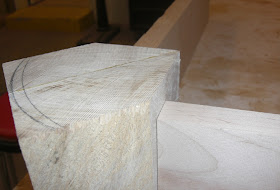
It's a subtle but completely necessary step. I took a small cut-off from one of the boards and glued it into the shape I'd drawn.


This was done more for size and scale, rather than to see the bookmatching. I know what that will look like, I just wanted to see how massive the leg will be, once it is cut to size.

Next, I placed a few pieces of wood next to the leg, to simulate how the aprons (or skirts) will look attached to the leg.

This arrangement gives me two choices, and it's a crucial part of the design phase.

I can either have the top of the leg flush with the table top, or I can tuck the leg back, under the top.

Playing with full sized mock-ups always helps me decide.
Now the hard part begins - which design do I choose?
No comments:
Post a Comment